Watch Motion
A journey through raw data
Project: Watch Motion
- Getting Started
- Data Collection
- More Training Data
- First try with on-device inference
- A journey through raw data
- Session recording
- More to come...
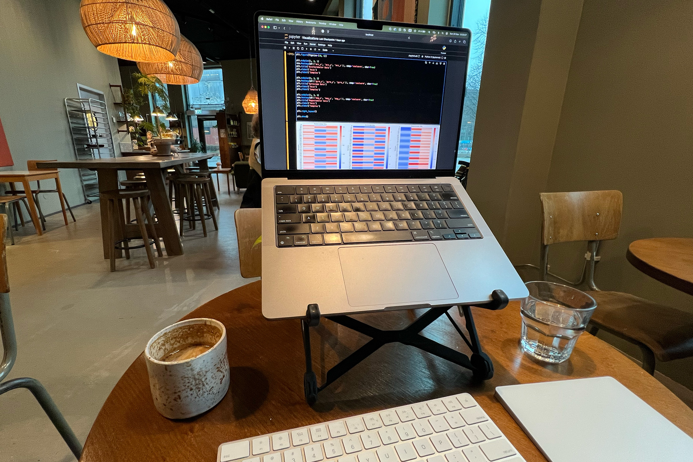
Spent a couple of hours at my favorite coffee shop this weekend to do some exploratory data analysis of the data collected so far.
Let's open up a Jupyter Notebook and dig into the data! First I list the contents of the bucket and print a couple of sample files for each exercise so we have something to work with:
+--------------+-----------------+------------------------------------------------+
| Exercise     | Number of Files | Sample Files                                   |
+--------------+-----------------+------------------------------------------------+
| battlerope   | 49              | 27PXR, 3S3Y9, 3ZYW5, 5A479, 5FLRB (+44 more)   |
| chins        | 54              | 2AJNF, 2JGC2, 2QD55, 3CQGL, 4UJBZ (+49 more)   |
| press        | 51              | 2XQWW, 2ZXJC, 39YPF, 3YXKX, 498DH (+46 more)   |
| situps       | 55              | 29V2P, 2Q9JU, 2SXVW, 4GNA3, 4PFVJ (+50 more)   |
+--------------+-----------------+------------------------------------------------+
Here's a sample of what each file looks like:
acc_x,acc_y,acc_z,gyro_x,gyro_y,gyro_z,mag_x,mag_y,mag_z
-0.1658,0.08798,-0.08062,0.3743,-0.8699,-0.4627,37.865,-11.728,-33.783
-0.1332,0.0951,-0.01393,0.4457,-0.9735,-0.5086,37.844,-11.771,-33.803
-0.07474,0.004615,-0.01889,0.3523,-1.0037,-0.4846,37.893,-11.788,-34.096
-0.02115,-0.07249,0.08809,0.05389,-1.0022,-0.5502,37.731,-12.035,-34.409
...
(1000 rows)
We'll look at a situps exercise since I believe those will have pretty clear patterns. Picking a random one (2Q9JU if you're curious) and plotting the different sensors looks like this:
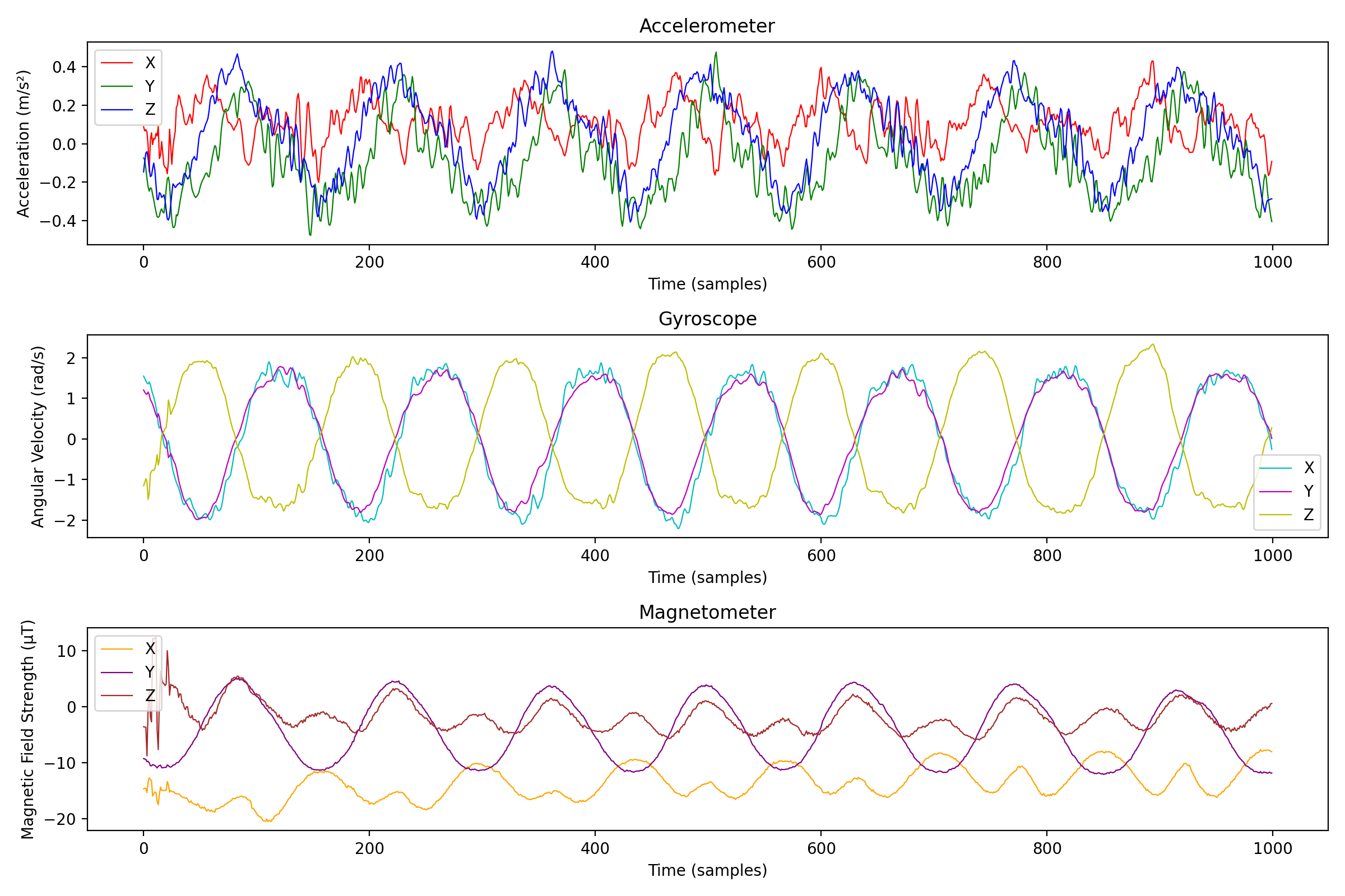
If we take a closer look at the data from the magnetometer, we can see that the first 100 or so samples are much noisier than the rest, probably due to sensor initialization and calibration. To remove this noise, we can simply discard the first 100 samples.
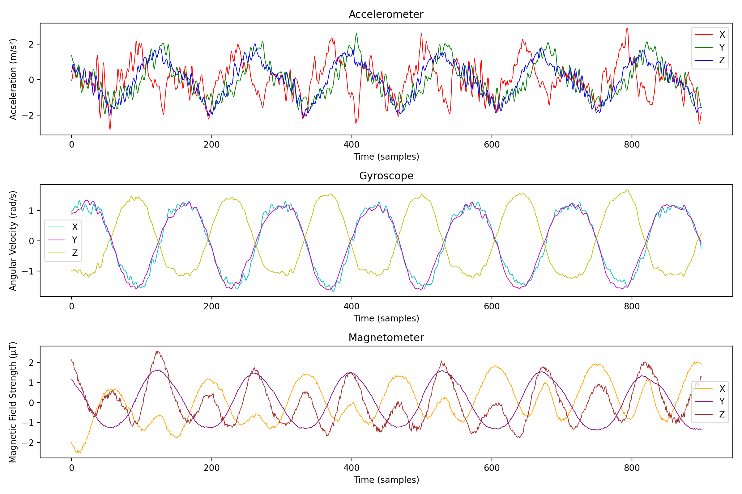
Let's also try to see what happens if we scale each column to have a mean of 0 and a standard deviation of 1:
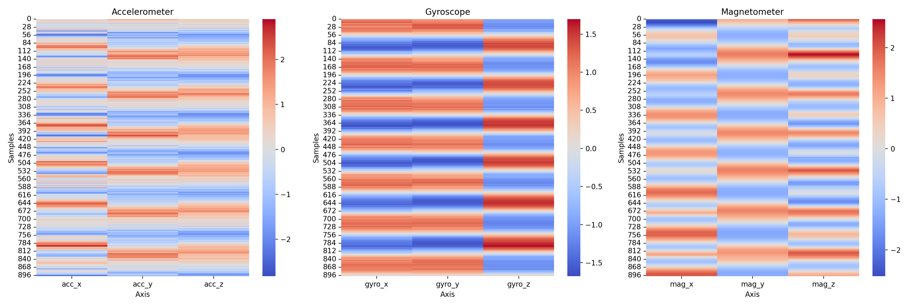
Next, let's plot a heatmap over the values to get a feel for the correlations between the different sensors:
The data is pretty noisy so we will apply a moving average to smooth it out, here's an example taking a window size of 100 samples:
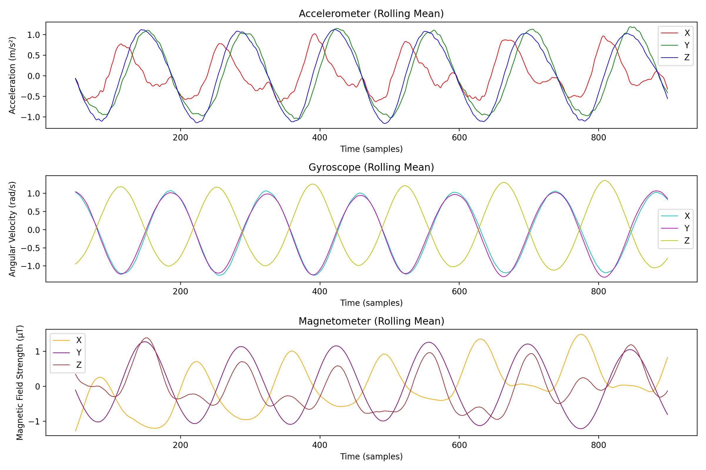
We of course lost some details, but we can now see the general trend of the exercise. Let's also try to do a 3D plot of the data to see if we can see any interesting patterns:
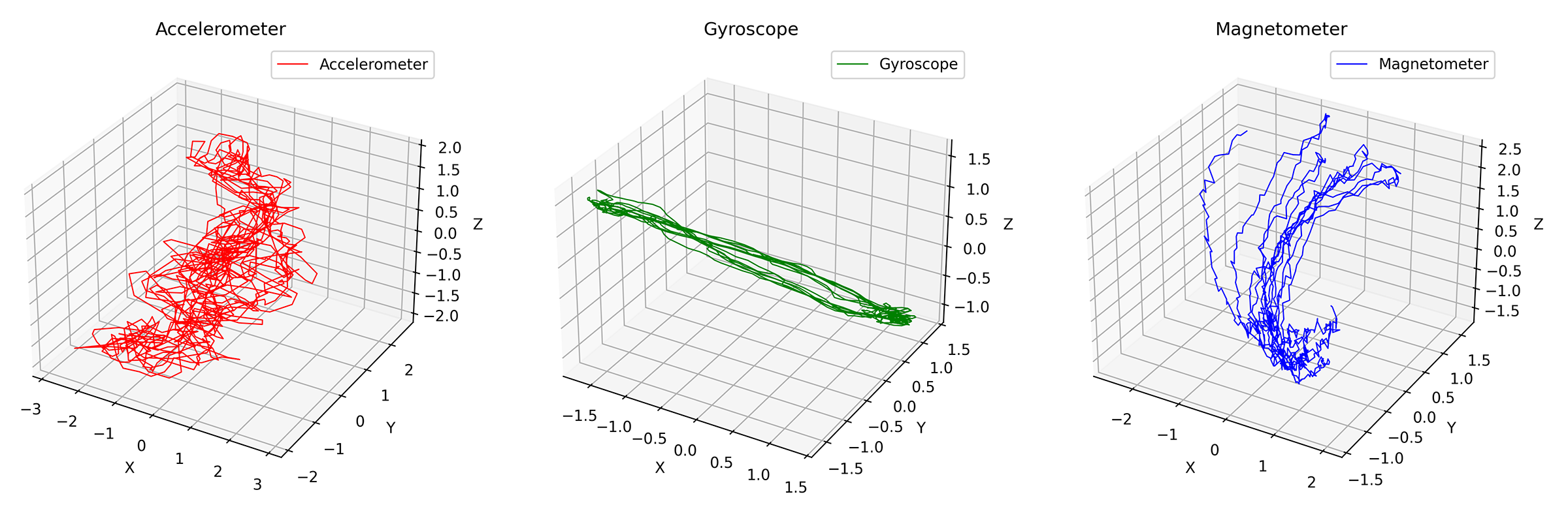
Also a bit noisy, but we can apply a moving average to smooth it out, here's another example with a window size of 100 samples:
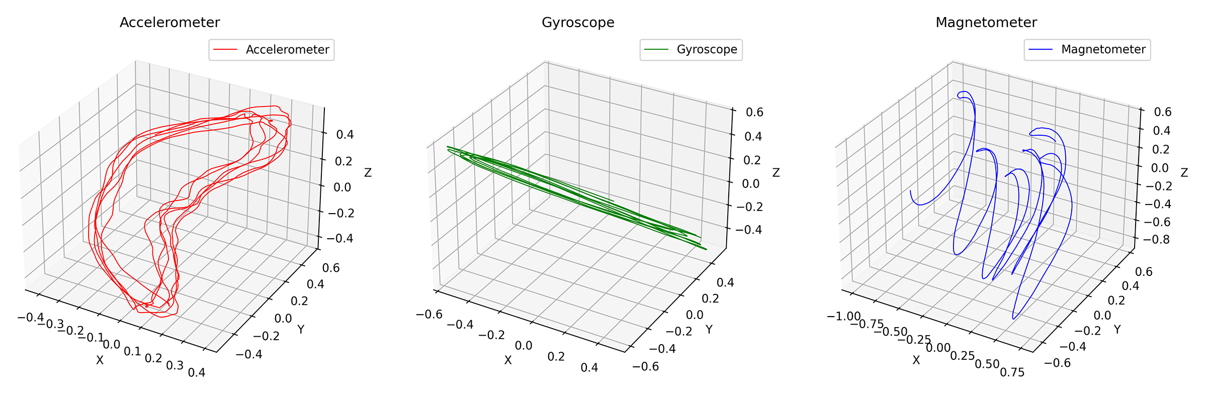
Very clear pattern for all sensors, especially if we disregard the X-axis drift of the magnetometer.
With this data, we should be able to detect peaks, valleys and other interesting features. Let's count the number of peaks for each sensor:
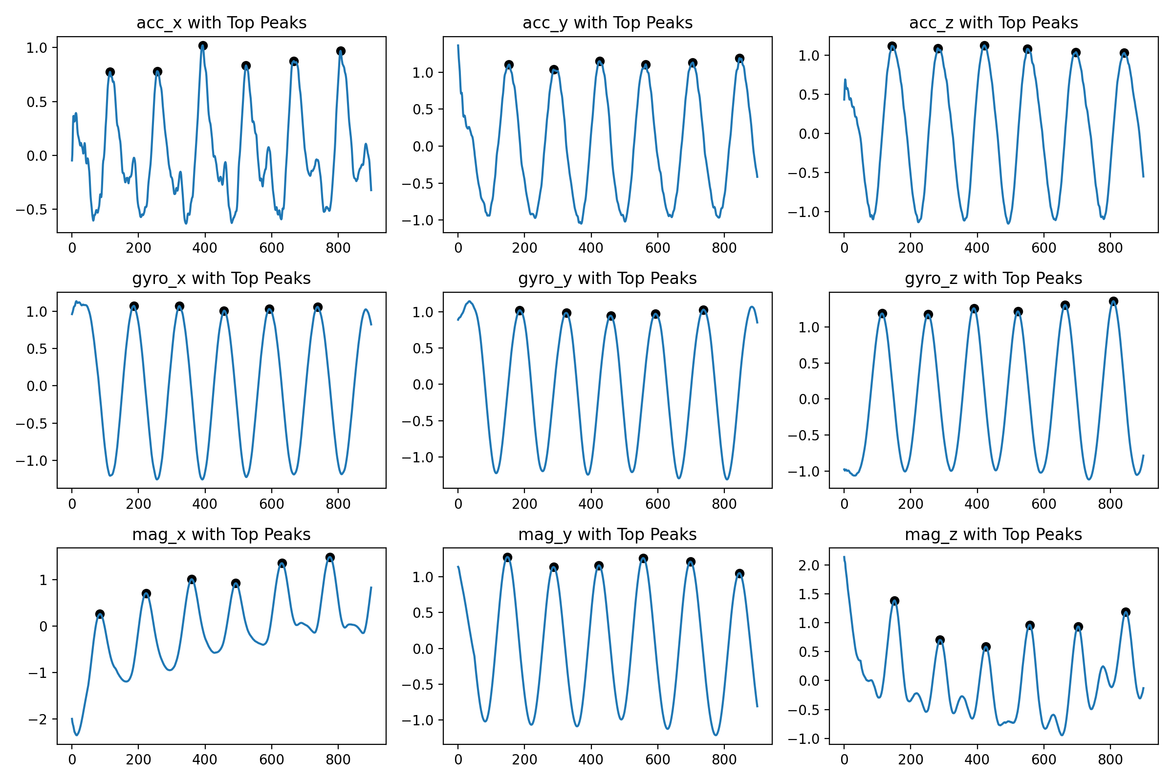
+-----------------+----------------------+
| Column          | Number of Peaks      |
+-----------------+----------------------+
| acc_x           | 7                    |
| acc_y           | 6                    |
| acc_z           | 6                    |
| gyro_x          | 5                    |
| gyro_y          | 5                    |
| gyro_z          | 6                    |
| mag_x           | 6                    |
| mag_y           | 6                    |
| mag_z           | 6                    |
+-----------------+----------------------+
I'm using the find_peaks function from the scipy library and it works surprisingly well. The signature looks like
find_peaks(x,
           height=None,
           threshold=None,
           distance=None,
           prominence=None,
           width=None,
           wlen=None,
           rel_height=0.5,
           plateau_size=None)
Using a prominance of 0.4 and a distance of 50 samples (expecting each exercise to take at least 0.5 seconds). One idea could be to just take the mean of the number of peaks for each column and let that be the number of repetitions. Remains to be seen how this approach generalizes to other exercises though.
And that's what we'll look at next!